We redesigned World Vision Canada's emergency donation experience to respond faster during crises and help more people, quicker.
Team roles
I led the project and UX working alongside, UR, UI, PM
Client side: PO, Marketing and Engineer
Project length
3-months


The business problem
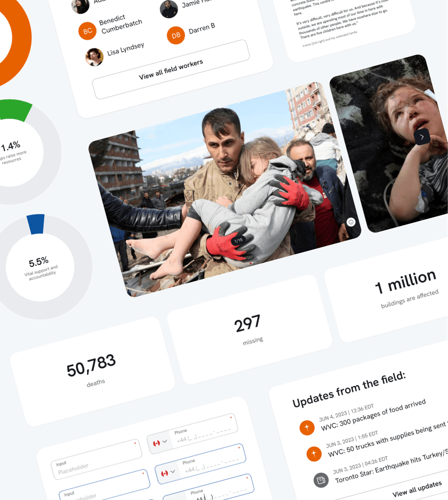
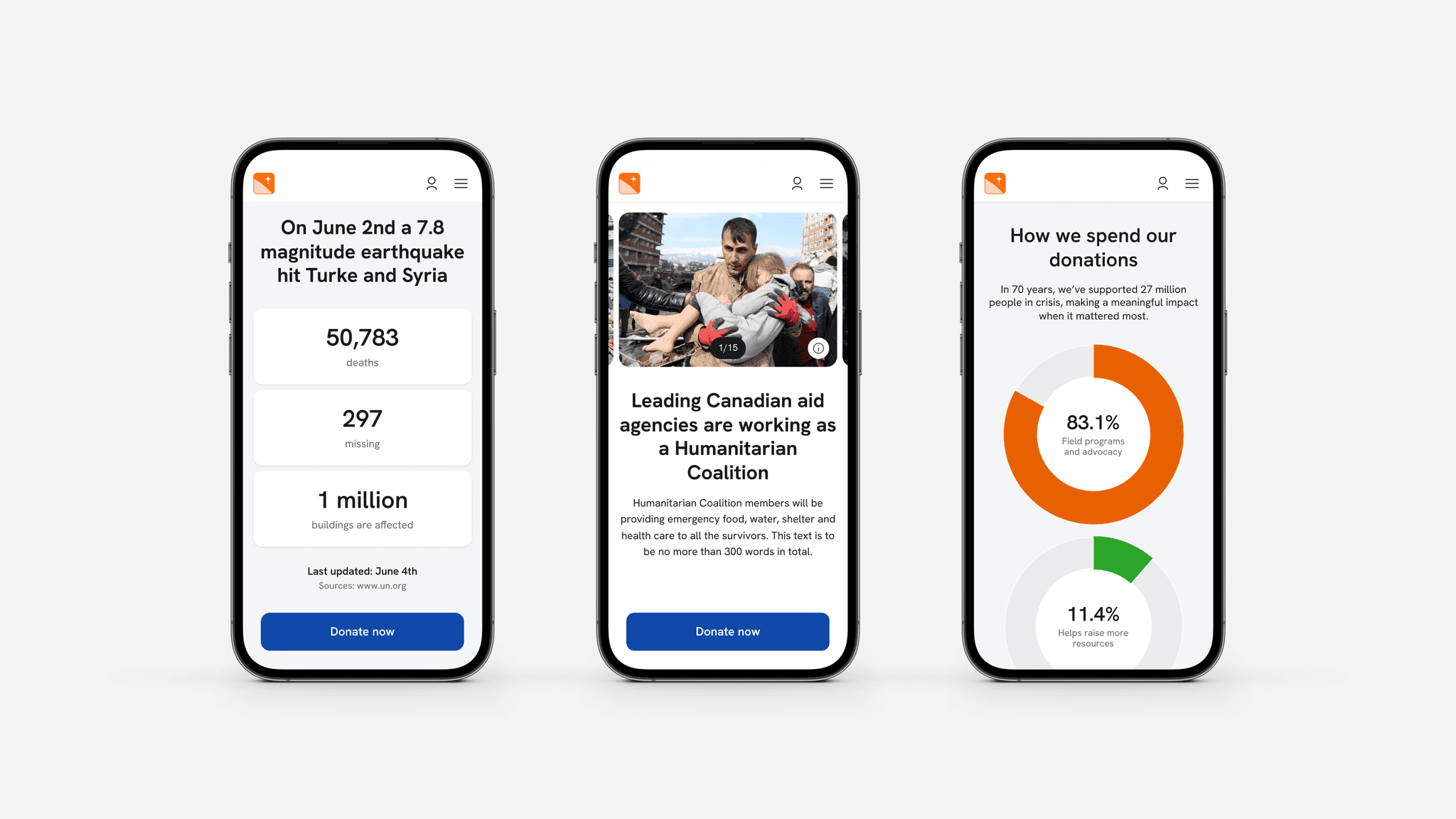
When emergencies hit, every minute counts, but World Vision Canada’s appeals were taking up to 6 days to go live, costing them critical donations. Their goal was to reduce that time to under 24 hours.
What we delivered and why it mattered
Every design decision was made to reduce friction for donors to increase donations and support internal teams creating appeals quickly. Here's what we did and how it impacted the business:
Designed a flexible appeal page that teams could build quickly using whatever assets were available
Reduced mandatory donation fields from 14 to 8, cutting friction and speeding up the donation process
Created a donor research repository to support future decisions and continuous improvement
Understanding donor behaviour
We began by digging into what motivates donors during emergencies. Through interviews, workshops and data analysis, one clear theme emerged: trust. People needed to feel their donation would reach those in need, and fast.
We also uncovered two main donor types:
Active donors who give regularly
Passive donors who give now and then, usually when an emergency happens
The new experience had to work for both. To guide the team, we created a service blueprint mapping the user journey against internal processes. This made it easier to see what slowed things down and where we could improve speed to launch.

Designing for key emotional moments
We found three key moments in the user journey where the appeal could really connect with donors:
The big choice
Donors had decided to give, but hadn’t chosen who to give to. This was a high-pressure moment where building trust fast was everything.The humble brag
Donating felt meaningful but deeply personal. Donors wanted to feel good without being pushed to share or upsell. We designed to support that private experience.The charity of choice
After the emergency, how do we stay top of mind so they come back next time?
To test our thinking, we created 12 early-stage concepts around these moments. They were designed to fail fast - not to sell, but to learn what did and didn’t resonate. This helped shape our MVP strategy and made sure we prioritised what mattered most to users.
We also discovered that while some people were driven by emotional stories and others by hard facts, nearly everyone wanted clarity that their donation would truly make a difference. That insight shaped everything from content choices to how we structured the page.

Design decisions that shaped the MVP
Split the appeal page up into sections that snap as you scroll
Created an immersive, story-led experience that was both emotional and informative. It also gave internal teams flexibility to launch quickly, even if they didn’t have all the content ready.Balanced emotional content with facts
We tested different content combinations and orders with users. This helped define a base layout World Vision Canada could adapt to suit different emergencies.Removed the 'become a member' nudge
Research showed users didn’t want extra asks during donation. This internal push was cut to reduce friction and let donors stay focused on completing their donation.Questioned every form field
We stripped the donation flow back to only the essentials. This aligned with our core goal: get help to people as quickly as possible.
We tested the full journey with real users and used their feedback to make the experience straightforward and quick for donors, so they could decide and donate without frustration. For internal teams, it meant launching pages faster and with less hassle - getting appeals live sooner to maximise donations when time mattered most.
Outcome
Strategy-led improvements:
Cut time to market for appeals from 6 days to 23 hours
Simplified donation journey from 5 steps to 3
Reduced mandatory form fields from 14 to 8
Shrunk team size needed to launch from 23 people to 7
This wasn’t just about design. It reshaped how World Vision Canada works, streamlining internal processes and empowering teams to launch appeals faster and with greater confidence. That change means they can respond to crises more effectively and deliver aid when it’s needed most.
